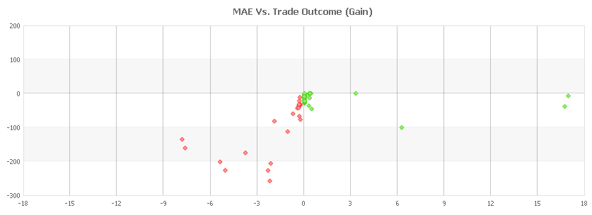
We’re happy to announce the addition of another useful tool to your toolbox: MAE/MFE Charts (available in your advanced statistics):

MAE stands for Maximum Adverse Excursion which is the maximal loss the trade had experienced before it was closed.
MFE stands for Maximum Favorable Excursion which is the maximum profit that the trade had experienced before it was closed.
This data is already available in each of your trades (for verified accounts) and now you can easily see it in a chart to easily identify better targets (take profit) and stops (stop losses).

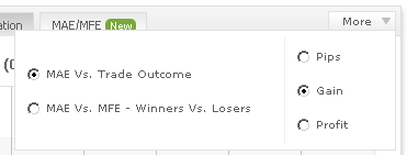
Using the ‘more’ button at the top will reveal the combination of 6 6 different charts:
- MAE Vs. Trade Outcome in pips
- MAE Vs. Trade Outcome in gain
- MAE Vs. Trade Outcome in profit
- MAE Vs. MFE – Winners Vs. Losers in pips
- MAE Vs. MFE – Winners Vs. Losers in gain
- MAE Vs. MFE – Winners Vs. Losers in profit
To start analyzing your MAE/MFE data, login and go to your portfolio.
Wish you a great week ahead!
The Myfxbook Team.
MAE/MFE data is an excellent addition for portfolio analysis. Thanks and looking forward to future features being added!
Thanks a lot!
Thank you, Guys! Finally I found a way to optimize and cut losses in my system. I need to rebuild little my system now. Great job!
anyways, how to analyze these graphs? and what’s on Y axis?
We don’t have any specific tutorials but there are a lot on the web – try googling for “mae mfe charts” 🙂