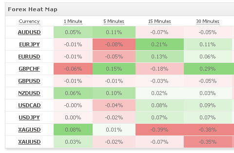
We have added another useful section to your forex toolbox – a real time currency heat map, showing you the strongest and weakest currencies according to your selection and in all time-frames at a glance.

Use the ‘more’ button to select the exact currencies for comparison. The strongest green cell is the currency which increased the most in the selected time frame while the strongest red cell is the currency which decreased the most in the selected time frame.
If you have a website, click the ‘Add to your site’ button to create a completely free widget for your website.
Let us know if you have any feedback or comments.
Wishing your a profitable week ahead!
The Myfxbook Team.
Nice work guys, could you add hourly, daily and weekly please.
Thanks David
Ok
Dears sir
This is very great system for me
Please you show me my balance and.Specailly ,I can withdrawal money for payment.
Please show and help me
Regards
Song Sina
Great idea. What do the colors mean. Should I be looking for RED or GREEN to trade?
To whom it may concern,
How about if don’t have website, which solution have for me to used this informatic tool.
Pls advise.
Thank you in advance.
JUST WANT TO KNOW HOW IT WORKS!
THANKS
thank you for the info