If you haven’t noticed yet, here are the latest features added in the past few weeks: Those of you who are using our newest service AutoTrade, can analyze AutoTrade provider performance in their portfolio by going to the “AutoTrade” tab in the “Trading” window; the data will also recalculate in real time in case you wish to custom analyze it:

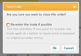
An option to re-enter a trade of a follower you’re closing manually (Tick the checkbox if you want to re-enter the trade again at a better or equal price (compared to original provider entry) – this is a very powerful feature which allows you to benefit from a ranging market while the provider is holding the position open:
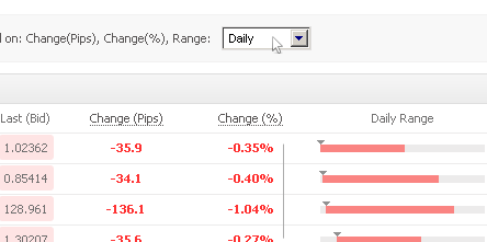
Option to configure timeframe for the forex market section which changes the 3 columns showing relative change: change in pips, change in percents and range bar:
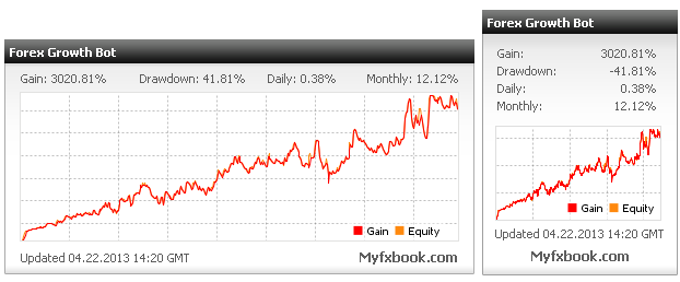
The widgets now include an equity curve:
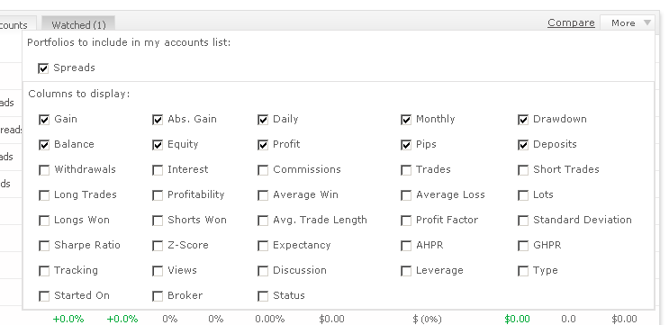
Option to customize fields (over 35!) in your accounts list in your dashboard:
Our super advanced Forex Calendar was refurbished to include quick access buttons for today, tomorrow, this week and custom dates:

And a minor update with the history spark-lines which are now colored blue (for long trades) and red (for short) trades for easier reading:
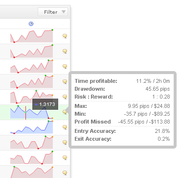
The trade analysis data was also added to your CSV statement which you can download.
Have a great week,
The Myfxbook Team.
For the history spark-lines you choosen Light Blue for Long what is nice
but Red for Short is imo misplaced in a combination.
Red suggests SL or something negative,
and does not match with Blue for Long.
My suggestion, the complementary color for Blue is Yellow.
Whats about Light yellow for Short ? 😉
Btw. thank you for the Site. Your are getting better and better every day since i know you, and every time i think the Top is reached you top it again. Thanks.
Your feedback is much appreciated! 🙂
We’ve tested many colors and yellow is quite hard to see. As far as red/blue combination goes – this is usually the color used for long/short interpretation in most trading applications (or green/red).
Ok, no prob.
And whats about to have the possibility to opt it out
over More/History Columns?
If you mean the ability to choose metrics from trade analysis to be seen in the history columns, then that is already possible using the ‘more’ button.